As long as we are judging Logos...

  • Some of the links on this forum allow SMF, at no cost to you, to earn a small commission when you click through and make a purchase. Let me know if you have any questions about this.
SMF is reader-supported. When you buy through links on our site, we may earn an affiliate commission.

eaglewing

Master of the Pit
Original poster
SMF Premier Member
Jul 4, 2008
1,132
365
St. Louis MO
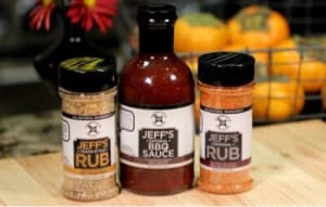
Made this one so far for my beginner catering I hope to get going soon.

I pick up my rig next weekend...
gona do magnet car stickers and probably a flag to mount on the rig...
don't know if I should ADD more to it or keep it simple.


fattedLOGO1.png


fattedLOGO2.png


fattedLOGO3.png


fattedLOGO4.png
 
That's the one I'd like to go with also... I don't really like the rounded over font, didn't turn out good enough.
 
THNX for the feedback guys...

That's what I needed,
PDT_Armataz_01_34.gif


I made the HOG a little bigger but this is probably what I'm gona run with...

fattedLOGO5.png

 
I'm not a judge, but I do like the bottom version.
 
I'll go with the bottom one myself. I think the table cloth is alittle too much.
 
Well one thing with any logo is easy, memorable, recognizable, gotcha from the beginning. For me that means the bottom one as the 1st with red checker tablecloth backgound is buisy to the eye. Just my 2 cents
 
The thing is, it doesn't have to even be that BLUE, I can make the circle fill ANY COLOR of the web spectrum... I just don't know what color would make it look the best really.... That's why I even made the table cloth. Thanks for all the feedback guys, I really appreciate it.
PDT_Armataz_01_34.gif

 
SmokingMeatForums.com is reader supported and as an Amazon Associate, we may earn commissions from qualifying purchases.

Latest posts

Hot Threads

Clicky